
This Article From Issue
May-June 2011
Volume 99, Number 3
Page 254
DOI: 10.1511/2011.90.254
ATLAS OF SCIENCE: Visualizing What We Know. Katy Börner. xii + 254 pp. The MIT Press, 2010. $29.95.
Academic disciplines are a comfort and a cage: Their shared literature creates communities and defines common problems, but they can also inhibit the exploration of uncharted territory. Disciplinary boundaries frame the basic questions of research. What should I read? Where should I look for new ideas or collaborators? Just as important, when should I stop reading? These questions are hardly new, but of late they have clearly taken on a new urgency. Mass digitization has lowered the barriers to entering unfamiliar fields and made it easy to find common interests in unexpected places. Even going to the library is now a rare chore.
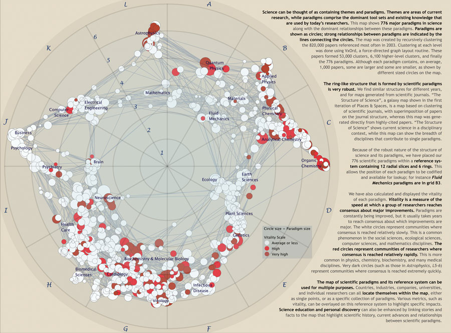
From Atlas of Science.
Ad Right
The premise of Katy Börner’s Atlas of Science is that the inherent fluidity of scientific cross-pollination—in analog and digital forms alike—requires new tools for understanding scientific literature and disciplinary formations. Disciplines are not consistent and self-evident domains of knowledge, but rather transient, emergent phenomena that are reconfigured as quickly as they crystallize. The bulk of Börner’s book is a detailed presentation of 18 “science maps” (that is, maps of science, rather than maps that are scientific) created by a diverse assortment of information specialists, engineers, scientists and designers. These are not geographic maps, but instead intellectual, social and conceptual ones; they mostly rely on the same bibliographic databases available to scholars, reoriented so that the tools of interdisciplinarity become evidence of their own impact. The maps were collected as part of an ever-evolving traveling exhibition curated by Börner since 2005, and they are now all freely available on the Web (at http://scimaps.org). The book thus participates fully in the trends it seeks to document. It is collaborative, cross-platform and interdisciplinary; it combines elements of the exhibition catalog, poster session, blog and monograph. Even Börner herself is a hybrid, with academic affiliations stretching from information science and statistics to cognitive science and biocomplexity.
The Atlas of Science advances two simple propositions. One is that its various graphs and diagrams are indeed maps that make up an orderly atlas. The other is that the subject of these maps is in fact science, defined liberally and expansively. Both of these claims are more provocative than they at first appear, and together they make this book relevant well beyond the specialist world of information graphics.
Börner shows convincingly that mapping science and mapping the Earth are allied endeavors, but their unstated differences are obvious throughout the book. It is certainly true that maps need not be geographic—mapping is about relationships, not just topography. This large conceptual umbrella, however, hides an important methodological difference between the maps in this book and more familiar varieties. The success or failure of a traditional statistical map is measured by its ability to make data legible; it must present obvious patterns, highlight anomalies and eliminate ambiguity. The maps collected by Börner instead place much more emphasis on data processing than on clarity. The maps’ descriptions tend to focus not on the authors’ graphic choices but on the specifics of each database, the steps required to process it, and possibilities for future iterations. The difference here might be described as one between cartography (or information design) and visualization. Cartography has traditionally been concerned with trustworthy representation—digesting complex data and giving it fixed visual form. Visualization, in contrast, is usually an ongoing process of data exploration, in which any individual image always seems less important than the algorithms used to create it.
This disconnect is both textual and visual. Börner spends her first three chapters establishing a long historical trajectory for science maps, complete with time lines, biographical vignettes and thumbnail reproductions of inspirational precedents. Yet the history of statistical cartography is surprisingly absent. Charles Joseph Minard’s famous map-chart of Napoleon’s retreat makes its requisite appearance, but that’s about it. Nowhere do we find the groundbreaking census atlases of Francis Walker and Henry Gannett, the cartograms popularized by Erwin Raisz, or the “scientific cartography” of Max Eckert and Arthur H. Robinson. Jacques Bertin’s powerful “graphic semiology” receives only a brief citation. The principal figures here are instead encyclopedists, librarians, computer scientists and futurologists—people such as Denis Diderot, Buckminster Fuller and J. C. R. Licklider. Börner’s own disciplinary interest is clearly not in the practice of mapping, but in the organization, analysis and automatic processing of massive amounts of data.
The science maps themselves likewise defy the norms of traditional cartography. About half the maps are network graphs of various kinds; most of the rest are variations of word clouds and time lines. In all cases, the most compelling maps are those that promise more than could ever be delivered in print. Many trip over their own vastness; they practically beg the reader to zoom in, click for more information or rerun the program with different parameters. The tangles of lines and color on the page might frustrate a reader seeking the clarity of a statistical atlas, but the dislocation between the evolving digital space of the algorithm and the finitude of the printed page is what makes these maps interesting. They point to new ways of understanding science precisely because they are not finished maps, but rather a new method of mapping altogether.
The version of science found in Börner’s atlas is also a rather specific one, simultaneously expansive and focused. No domain of human knowledge is left out, and the unity of the sciences is taken as a given. The statistics marshaled here include everything from the contents of specialist physics journals to the growth of book production since the 17th century. Nevertheless, nearly all the maps share a consistent concern with the individual scientific publication as the unit of scientific practice. Some maps chart changes in narrow subspecialties, whereas others tackle all fields at once, but the focus remains on practices of authorship, especially complex networks of citations, collaborations and keywords. About half the maps rely on citation analysis alone, and all but three use databases of a similar sort: Wikipedia histories, patent activity, conference abstracts and so on.
This focus is largely to the book’s credit. These sources are deep and rewarding, and the resulting maps show decisively that clear disciplinary boundaries are the exception rather than the rule. But it is relatively easy to imagine other ways that science might be mapped, especially once the idea of mapping includes things like word clouds. Could the methods used for tracking citations also generate maps of pedagogy, funding structures, conference attendance, lab techniques or professional organizations? Or even more broadly, what about maps of the effect of science on everyday life, the role of science in public policy, or the tensions between science and other ways of knowing? All of these are data-rich areas that could be well served by new forms of visualization.
Börner and her collaborators, however, never venture far from bibliography. Perhaps this means that the Atlas of Science simply falls short of its ambitious title. Perhaps it ought to have been called something like Bibliographic Visualization instead. But this kind of modesty would be unsatisfying, because the narrowness of the book’s idea of science in fact ends up offering a rather radical vision of our disciplinary future, and its methods deserve the careful attention of scientists and designers alike. My own impression is that the book is more radical than even Börner would acknowledge. It is a kind of methodological wolf in sheep’s clothing, with each synoptic, information-dense science map acting as a quiet manifesto against our slow, linear and bulky reliance on text.
At its most forceful, Börner’s project is only partly about mapping the sciences. Instead it positions data visualization as an indispensable part of organizing and navigating scientific literature. This is a potentially monumental shift—a shift from words to images and from discrete legible units to the fuzzy impression of the overall pattern. It could easily rival the shift we have already seen from ordered indexes to search as the preferred mode of navigating text. The methodological disconnects between the science map and traditional notions of cartography (and science) should thus be taken very seriously, since science maps are not just a new graphic portrayal of scientific authorship. They are instead harbingers of new bibliographic methods that could lead to new ways of practicing and steering science itself.
What will happen when scientists see network graphs as a viable alternative to the literature review? Or when funding agencies start using visualization to encourage new disciplinary constellations? The vision of data-driven bibliography is an optimistic one. It offers fascinating new tools and proposes that we simply try them out. But this means that our job as researchers will be to ask how the tools can address the tasks that matter to us, rather than simply accepting what they can already do.
William J. Rankin is finishing a dual Ph.D. in history of science and architecture at Harvard University and will be an assistant professor of history at Yale University beginning in the fall of 2011. He is currently writing a book on the history of the mapping sciences, sovereignty and U.S. military globalism in the decades surrounding World War II, tentatively titled After the Map: Cartography, Navigation, and the Transformation of Territory in the Twentieth Century. He also publishes maps of his own and maintains a website about mapping at http://radicalcartography.net.
American Scientist Comments and Discussion
To discuss our articles or comment on them, please share them and tag American Scientist on social media platforms. Here are links to our profiles on Twitter, Facebook, and LinkedIn.
If we re-share your post, we will moderate comments/discussion following our comments policy.