Why We See What We Do
By Dale Purves, Surajit Nundy
A probabilistic strategy based on past experience explains the remarkable difference between what we see and physical reality
A probabilistic strategy based on past experience explains the remarkable difference between what we see and physical reality
DOI: 10.1511/2002.9.236
Visual illusions fascinate people. What we see—whether considered in terms of the brightness of objects, their colors or their arrangement in space—is often at odds with the underlying reality measured with photometers, spectrophotometers or rulers. In the 18th century, the Irish philosopher George Berkeley provided some insight into these discrepancies.
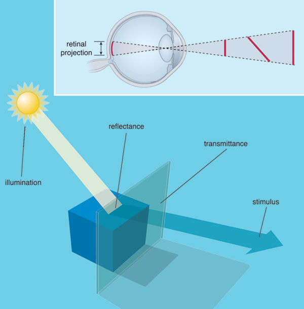
In his "Essay Towards a New Theory of Vision," Berkeley pointed out that the judgment of distance, for example, cannot be derived directly from the geometrical information in the retinal image. Thus, a given line in the retinal image could have been generated by the edge of a physically small object nearby, or equally well by an edge associated with a larger object farther away.
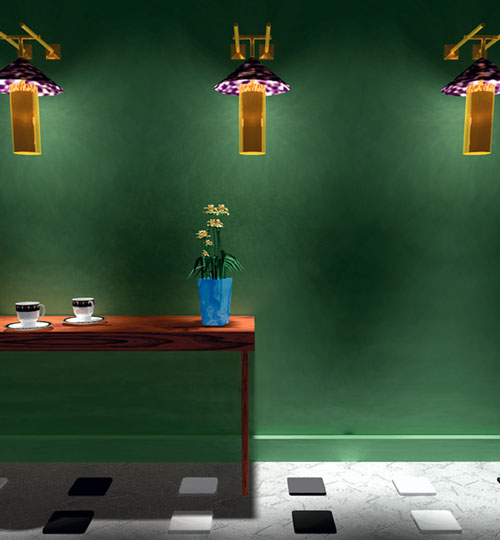
Image courtesy of Dale Purves, R. Beau Lotto and Surajit Nundy.
Indeed, all retinal information suffers from this inherent ambiguity. The illumination of objects and the physical properties that determine the amount and quality of light that objects return to the eye are also conflated in the retinal stimulus; thus Berkeley's general argument applies to sensations of brightness and color, as well as to the perception of space. In each of these basic aspects of vision, the information in the retinal image cannot directly reveal the true sources of the stimulus in the physical world. As a result, the relation between the world and our perception of it is, by its nature, an uncertain one.
In addition to providing some indication of why what we see might not always tally with reality, this fundamental fact about vision presents a biological dilemma. Survival in a complex and potentially hostile environment clearly depends on responding appropriately to the physical reality that underlies the images on the retina. For example, mistaking a smaller object nearby for a larger but more distant one could obviously be disastrous for a deluded observer. If, however, the image on the retina cannot uniquely define the underlying reality that the observer must respond to, how then does the visual system generate behavior that usually deals successfully with a world that it cannot directly apprehend?
As we show here, a growing body of evidence indicates that the visual system of humans—and presumably many other visual animals—solves Berkeley's dilemma by generating perceptions on a wholly empirical basis. Rather than analyzing the components of the retinal image as such, percepts are determined probabilistically, using feedback from the outcome of visually guided behavior in the past to progressively improve performance in the face of the inevitable uncertainty of retinal information. The result of this process, and indeed the evidence for it, is that what we perceive accords not with the features of the retinal stimulus or the properties of the underlying objects, but with what the same or similar stimuli have typically signified in both the experience of the species over the eons and the experience of individuals over their lifetimes.
The physical intensity of a light stimulus elicits sensations of relative lightness and darkness, which are arguably the most fundamental aspect of vision. Although a sensible expectation is that the sense of brightness should scale directly with the intensity of light, such that a more intense light coming to the eye always corresponds to a stronger sensation of brightness, this is not the case. In fact, two surfaces reflecting the same physical amount of light to the eyes typically look differently bright—or light—if the surfaces are observed in surrounds that are themselves returning different amounts of light. This phenomenon is called simultaneous brightness contrast.
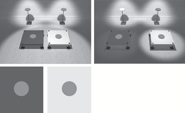
In the past, neurobiologists based the explanation of this well-known effect on the fact that retinal neurons that send information from the eye to the visual part of the brain happen to respond more vigorously to a gray patch in a dark surround than the same gray patch on a light surround—for reasons that have to do with optimizing edge detection. If the firing rate of retinal neurons determined the apparent brightness of the patches, then the patch on a dark background would be expected to look brighter than the same patch on a lighter background.
The problem with this interpretation is that, among other things, patches embedded in scenes that have exactly the same surrounds can also be made to look differently bright. Indeed, as first shown by the 19th-century physicist Wilhelm von Bezold, a target surrounded by territory of predominantly higher luminance can—under the right circumstances—look brighter than the same target surrounded by territory of lower average luminance. This is just the opposite of the standard simultaneous-brightness-contrast effect, and the opposite of what the retinal-firing-rate explanation of brightness predicts.
How, then, can these puzzling facts about the relationship between the physical intensity of light and ensuing sensation of brightness be explained? Recall that the identical intensities of light arising from the two surface patches in question are inherently ambiguous. That is, similarly reflective surfaces under the same illuminant or differently reflective target surfaces under different amounts of illumination can generate identical stimuli at the eye. Suppose that this uncertainty is resolved entirely on the basis of past experience with what the source of such stimuli usually turned out to be, determined by the success or failure of the related behavior. Then to the extent that a stimulus of this sort is consistent with past experience of similarly reflective target surfaces under the same illuminant, the targets will tend to appear similarly bright, because things that are the same need to look the same to be behaviorally useful. However, insofar as the stimulus is consistent with the experience of differently reflective objects in different levels of illumination, the targets will tend to appear differently bright, because things that are different need to look different to be useful to the observer. Because the information in the standard stimulus for simultaneous brightness contrast is consistent with both different surfaces under different illuminants and similar surfaces under similar illuminants, then what the observer sees will reflect both possibilities. In statistical terms, the stimulus is in some degree consistent with surfaces having different reflectances, so the identical patches in the standard demonstration of simultaneous brightness contrast will look differently bright.
This may seem a strange way to generate visual percepts. Given the inevitable uncertainty of the information in the retinal image, however, this strategy may be the best—or even the only—way to resolve Berkeley's dilemma.
If this general explanation is correct, then the same perceptual effect should be elicited by any stimulus in which target territories of the same luminance have typically turned out to be differently reflective objects in different amounts of light. A particularly interesting challenge is the percept generated by a more complex stimulus called the Cornsweet edge, which is named after Tom Cornsweet, the psychologist who described this effect in the late 1960s.
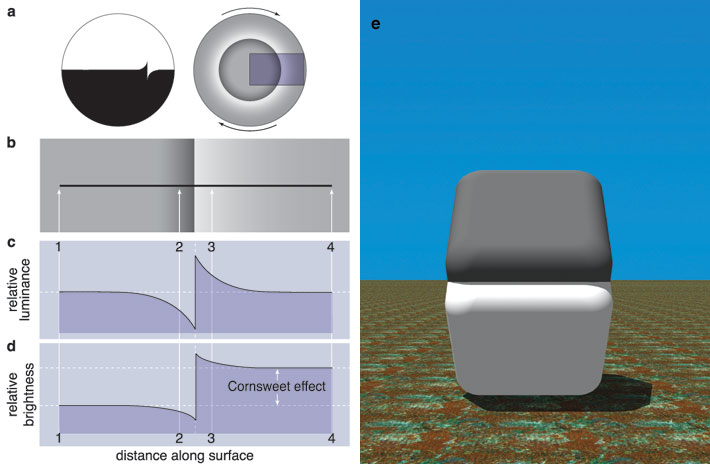
In the Cornsweet effect, opposing luminance gradients that meet at an edge make physically identical adjoining regions look differently bright. Specifically, the region adjacent to the lighter gradient appears brighter than the region next to the darker gradient. Because this perceptual effect is the ooposite of the effect of standard simultaneous brightness contrast, the Cornsweet stimulus provides yet another example of why explanations based on local contrast relations do not work.
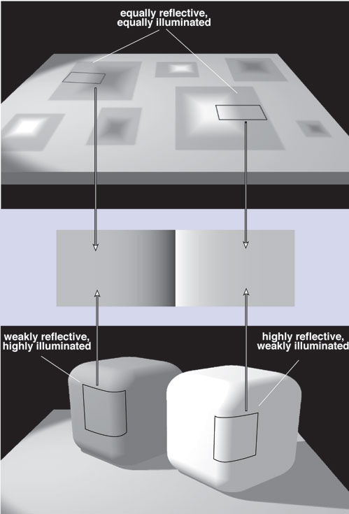
Despite its seemingly complicated structure, the Cornsweet-edge effect can also be explained in empirical terms. The common denominator of the Cornsweet stimulus and conventional simultaneous-brightness-contrast stimuli is that the percepts can both be understood in terms of the possible sources of the physically identical target territories. Thus, the equiluminant regions bordering the gradients that comprise a Cornsweet edge could have been generated by similarly reflective surfaces under the same illuminant—including painted gradients on the surface of a piece of paper on which light falls uniformly—or differently reflective surfaces under different intensities of illumination—including a cube with rounded edges placed so that one side is in light and another in shadow. Since both scenarios, and a host of others, are real possibilities, the percept elicited by the stimulus will, according to a wholly probabilistic theory of vision, take all the possible sources into account in proportion to their occurrence in the past. Given that the stimulus will often have been generated by differently reflective surfaces in different illumination, such as the cube scenario, the target territories will look differently bright.
If this statistical explanation based on past experience has merit, then the perceptual effect of the Cornsweet edge should be increased, decreased or even abolished simply by altering the relative probabilities of the possible sources of the stimulus without changing the stimulus as such. As various experiments show, this is the case.
Given that these otherwise puzzling aspects of the sensations elicited by the intensity of light can be understood as a consequence of a wholly probabilistic strategy of vision, we wondered whether the color sensations elicited by different light spectra might also arise in this way. After all, the distribution of spectral power in a light stimulus, which is what gives rise to sensations of color, is ambiguous for exactly the same reasons as is the overall spectral intensity. Illumination, reflectance and other factors that determine the characteristics of the light that reaches the eye are inevitably intertwined in the retinal image and cannot be disentangled.
A good starting point in thinking about color sensations in these terms is simultaneous color contrast, a phenomenon similar to the brightness contrast effects already described. Two targets with the same spectral composition placed on differently colored backgrounds serve as standard stimulus for eliciting color contrast. As in brightness contrast, the two targets look different, but now in terms of their respective color qualities: hue, saturation and color brightness. In the past, most explanations of this phenomenon relied on some sort of color averaging across the entire stimulus. As in brightness contrast, however, these schemes fail to account for the fact that color contrast stimuli can be crafted in which the same average chromatic surrounds elicit different color percepts.
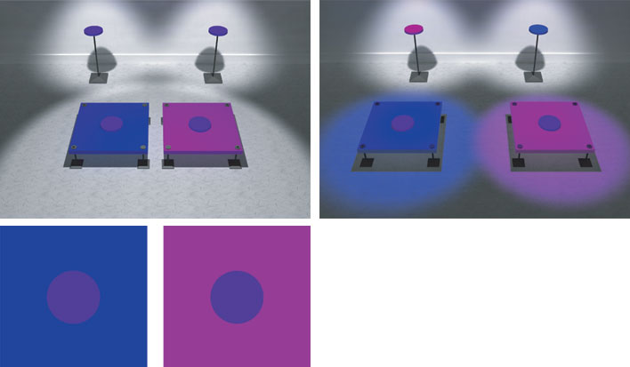
An explanation of color contrast can, however, be given in empirical terms. The sources of the target and surround in standard color-contrast stimuli are profoundly uncertain, because an infinite number of combinations of reflectances and illuminants—and other less crucial factors—can generate the same distributions of spectral power. As in the case of achromatic stimuli, the visual system could resolve this dilemma by using feedback from the success or failure of the past behavioral responses to spectral stimuli. The percept elicited by a given stimulus would thus be determined by the relative frequencies of occurrence of the real-world combinations of reflectances and illuminants that gave rise to that distribution of spectral power in the past. The same argument can be applied to color constancy, which describes the related phenomenon in which the same object continues to appear similar in color despite being under different illuminants.
If perceptions of color contrast and constancy are generated in this way, then the same spectral target on two differently chromatic backgrounds would be expected to give rise to different chromatic sensations. The reason is that, in addition to requiring behaviors appropriate to the same reflectances in the same illuminant, such stimuli would in other instances have required behaviors appropriate to targets that arise from different reflectances in different illuminants. Consequently, a spectral stimulus should elicit a sensation that incorporates all possible underlying sources in proportion to their past occurrence in human experience.
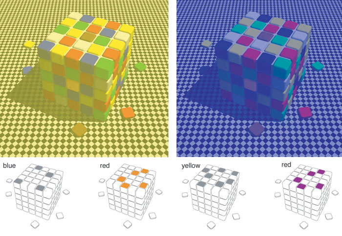
To get across the merits of this way of understanding color percepts, we devised a stimulus that looks something like a Rubik's cube. By understanding the effects of spectral differences in this probabilistic way, we could generate color contrast and constancy effects that are much more dramatic than the usual textbook illustrations of these phenomena. For example, when all the information in a scene with the cube was made consistent with either yellowish illumination or bluish illumination, tiles on the surface of the cube that appear the same shade of gray in a neutral context could be made to appear either blue or yellow, respectively. This manipulation provides an impressive example of color contrast made especially dramatic by empirical manipulation of the information in the scene. Conversely, tiles that appear differently colored in a neutral setting could, by changing the probability of their possible sources, be made to look the same color, thus providing an equally dramatic demonstration of color constancy. These demonstrations show not only that color contrast and constancy are determined probabilistically, but also that these seemingly opposite effects are both manifestations of the same empirical generation of visual percepts.
Vision scientists noted long ago that the perception of lines does not always accord with the real-world geometry of the underlying objects. For instance, the angles formed by lines making, or implying, an acute angle are seen as being a few degrees larger than they really are, whereas obtuse angles are seen as being a few degrees smaller. Despite a great deal of speculation about this anomaly dating from the latter part of the 19th century, there has been no consensus about its origin. Thus we asked whether these and other geometrical misperceptions might be explained in much the same empirical terms as brightness and color.
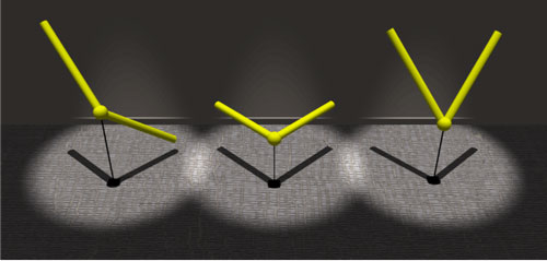
Much like luminance or spectral power, the stimulus that gives rise to a perceived angle is profoundly ambiguous. An angle projected onto a surface—the retina, for example—can arise from objects having a variety of measured angles and arm lengths, arranged in infinitely many three-dimensional orientations. In interacting with the objects that give rise to particular angle projections on the retina, observers through the ages would have experienced great variation between a given angle in retinal projection and the angles of its real-world sources. Moreover, the variations are systematic. In consequence, the perceptions elicited by different angles projected onto the retina would be expected to correspond to these frequency distributions.
To test this interpretation, we first needed to determine the probability distribution of all the possible three-dimensional sources of a projected angle. When these distributions for all possible angles were computed using the principles of projective geometry, we found that acute-angle projections usually come from sources with larger angles than the projections. Conversely, the sources of obtuse-angle projections are typically generated by sources that are somewhat smaller than the projected angle. Right-angle projections and straight lines are generated by sources that, on average, have the angular subtense of the object itself. If percepts are determined empirically, then the visual system should generate perceptions of angles that incorporate and reflect these statistical facts of projective geometry.
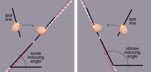
We assessed this prediction by asking subjects to report their perceptions of different angular stimuli in a series of tests in which the adjustment of a test line indicated the angular subtense they were actually seeing. For example, if the subject perceived the angle to be bigger than it actually is, then the test line would be set in a position that revealed this discrepancy—being not quite parallel with the angle's arm. The results derived from such tests tallied quite well with the probability distribution of the possible sources of the corresponding stimuli, indicating that the spatial arrangement observers see is neither the retinal projection nor its real-world source, but its empirical, or past, significance.
Taken together, this evidence drawn from the perception of brightness, color and geometry supports the idea that the problem first emphasized by Berkeley is resolved by generating visual percepts according to the probability distribution of the possible sources of the visual stimulus, whatever it may be. As a result, observers see what a visual scene typically signified in the past, rather than what it actually is in the present. We see what we do, therefore, because the statistics of past experience is the basis on which the visual system contends with the dilemma posed by the inherent ambiguity of visual stimuli.
We are grateful to Mark Williams for assistance with many of the figures and to the National Institutes of Health for support.
Click "American Scientist" to access home page

American Scientist Comments and Discussion
To discuss our articles or comment on them, please share them and tag American Scientist on social media platforms. Here are links to our profiles on Twitter, Facebook, and LinkedIn.
If we re-share your post, we will moderate comments/discussion following our comments policy.