A Vennerable Challenge
By Robert Kosara
The best solution for visualizing data is sometimes a simple one
The best solution for visualizing data is sometimes a simple one

DOI: 10.1511/2009.76.58
A Venn diagram is an unusual choice for data representation. It serves a very specific purpose, to show two or three sets and how they intersect. What works well to teach children the basics of set theory might not be the best for visualizing set-based data, however.
The Venn diagram below was posted on the blog Nuit Blanche with a challenge to improve it. The diagram originated in a 2006 Archives of General Psychiatry article that compared techniques used to diagnose autism. The authors compared the performance of clinicians (clinician), the Autism Diagnostic Interview–Revised test (ADI-R) and the Pre-Linguistic Autism Diagnostic Observation Schedule test (PL-ADOS). They sought the most successful single or combined diagnostic technique used with two-year-old children. The prevalence figure is the percentage of children later confirmed as autistic.
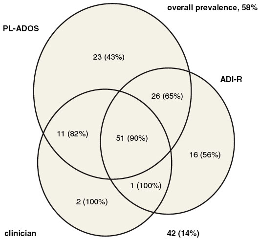
Originally published in Archives of General Psychicatry, 2006. Copyright © 2006 American Medical Association.
Significant problems were immediately apparent. Different-sized circles and intersections in the diagram appeared to suggest something meaningful about the data but were arbitrary. Rather than being able to scan the diagram quickly to understand the data, a reader had to study numbers and compare them. The diagram hindered understanding more than it helped.
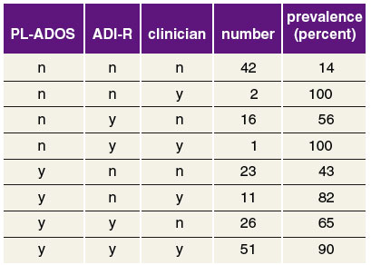
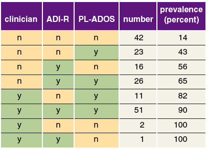
My first step in tackling a redesign was to extract the numbers and list them in a table. Often, a simple data table is the best choice for presenting and analyzing small data sets such as this. Although the number of combinations complicated things, the table let me reorganize the data simply by sorting the prevalence numbers. My hope was that this would make the strongest diagnostic approach readily apparent. I was not disappointed. Reordering the first three columns after sorting made it clear that clinicians had the best chance of being right. The two 100 percent cases were based on exceptionally small samples, of course, but the pattern persisted even when they were excluded.
Robert Kosara
In addition, the three diagnostic columns formed a hierarchy (or a tree, as computer scientists would call it). The clinicians’ yes or no divided the table into an upper and lower half, and each was in turn divided into two by ADI-R. Each of those four quarters was split into one yes and one no group by PL-ADOS.
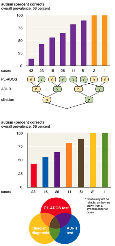
This hierarchy became the central idea for my redesign. In addition to displaying the numbers in a familiar bar chart format, I added a node-link diagram to show the data’s structure. The “y” nodes denote autism diagnoses; the “n” nodes denote cases where autism was not diagnosed. The combination of yes and no answers can be read along the lines leading to each bar.
Robert Kosara
The neat layout of the tree, with only one crossing line, reinforced the success of clinicians (by locating them at the first bifurcation). ADI-R was second and PL-ADOS last.
Although the tree diagram may be less familiar than a Venn diagram, the approach has advantages. It provides more useful information, it shows numbers in a way that can be easily compared and it displays relationships between subsets without interfering with the data.
Another Nuit Blanche reader, Patrick Murphy, found my design confusing and developed an alternative. He reintroduced the Venn diagram, coloring its sections and bars in the same palette. This way, the Venn diagram showed overlapping successes while precise numbers were illustrated in a bar chart.
Robert Kosara and Patrick Murphy
There were more than a dozen other redesigns, including some posted here: http://snipurl.com/revenn. All provide the data in a readable fashion and make it easier to analyze.
Visualizing abstract data is difficult. In many cases, a simple bar or line chart just doesn’t cut it. If you need to visualize complex data or know of depictions that should be improved, submit your problem to me at my website: http://eagereyes.org/ask. I may discuss entries (and proposed solutions) in future Sightings columns.
Click "American Scientist" to access home page
American Scientist Comments and Discussion
To discuss our articles or comment on them, please share them and tag American Scientist on social media platforms. Here are links to our profiles on Twitter, Facebook, and LinkedIn.
If we re-share your post, we will moderate comments/discussion following our comments policy.