Seeing Stars
By Felice Frankel
Astronomy professor Jeff Hester discusses photographing the birth of stars
Astronomy professor Jeff Hester discusses photographing the birth of stars

DOI: 10.1511/2004.49.462
A few years ago, an image of stars being birthed in the Eagle Nebula appeared on the front pages of some of the most important newspapers in the world. People were stunned by its eerily exotic colors and forms. The "representational color" applied by the scientists processing Hubble Space Telescope data helped communicate the rich information captured by the telescope’s cameras and should, in my opinion, be included whenever the image appears. Jeff Hester, professor in the Department of Physics and Astronomy at Arizona State University, tells us how he and colleague Paul Scowen of Arizona State created this memorable look into the universe.
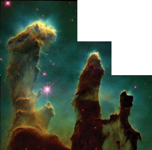
Jeff Hester and Paul Scowen, Arizona State University, and NASA
F. F. Can you first describe to us how the image was constructed?
J. H. The image is constructed out of 32 separate images made using four different filters. Each of the four quadrants of the image is a physically separate camera. Making the final image involved: (1) calibrating each frame and removing various "instrumental signatures" such as bias levels, pixel–to–pixel sensitivity variations, errors in digitization and dark currents, etc.; (2) identifying and rejecting various artifacts such as the streaks left by cosmic rays as they passed through the detectors; (3) combining all of the images taken through a given filter into a single frame (which entailed alignment, correction of geometrical distortions and stitching individual images together into a four–chip mosaic); and (4) combination of the different single–filter mosaics into a color image.
In the final image, blue represents light in an emission line (a distinct emission wavelength) from doubly ionized oxygen. Green represents light in the distinct wavelength emitted when a proton and electron combine to make a hydrogen atom. Red represents light in a line emitted by singly ionized sulfur atoms. So the colors show variations in the level of ionization and excitation from place to place. It is a map of the physical properties of the gas. It turns out that it is also closer to what you might see through a telescope with your eye than is a picture taken with color film.
Start to finish, I spent the better part of a week turning the raw data into the final frame—time that included working on the computer code used to carry out several of the steps mentioned above.
F. F. How long did it take to capture the data?
J. H. Let’s see.… As I recall, there were six HST orbits of exposure used to make the final image. So that’s about 9 hours of telescope time, during about 4 hours of which the shutter was actually open.
F. F. Did you and Paul Scowen work together on all aspects of the final image? Did you disagree on various decisions? If so, how did you resolve your differences?
J. H. Paul was actually the first to see the data and made a rough version of the image. The image that was released to the public was a version of the image that I produced. There was not much in the way of discussion of the image colors and the like. There was a lot of discussion about the science present in the image.
The real issue when you look at an image like this is that there is one hell of a lot of information present. Interpreting that information is not like interpreting a simple plot or graph. Instead, you have to look at the relations between different aspects of the image, as well as the variations in physical properties of the gas from place to place.
Interestingly, the beauty of the image is not happenstance. When people talk about "beauty," they are talking about the presence of pattern in the midst of complexity. Pattern recognition is so important to humans that perceiving patterns in the midst of complexity is pleasurable to us. To a great degree, the same patterns present in the image that make it aesthetically pleasing also make it scientifically interesting. Our reason for combining the data in this fashion was not to make a pretty picture just for the sake of making a pretty picture. Rather, it is by combining the data into a "pretty picture" that we present the information in a form that the human brain can more readily perceive. In short, we use color in the image in much the same way that an artist uses color. We use it as an interpretive tool to present our observations of the world in a way that other humans can more readily understand.
Click "American Scientist" to access home page
American Scientist Comments and Discussion
To discuss our articles or comment on them, please share them and tag American Scientist on social media platforms. Here are links to our profiles on Twitter, Facebook, and LinkedIn.
If we re-share your post, we will moderate comments/discussion following our comments policy.