Population Growth, Technology and Tricky Graphs
By Peter Schulze, Jack Mealy
Debunking a popular view of human population growth
Debunking a popular view of human population growth

DOI: 10.1511/2001.22.209
The extent to which human beings affect the environment depends, in large measure, on the number of people in the world. Despite the paramount significance of this statistic, many students, environmental analysts and even policymakers have a distorted understanding of the history of population growth. The confusion stems from a single misleading graph that often appears in the environmental literature.
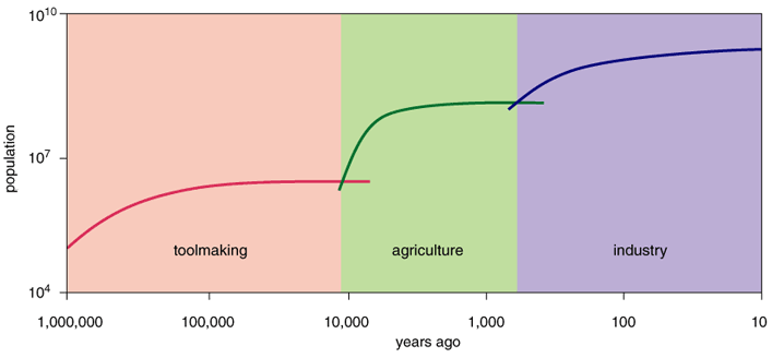
The graph in question gives the distinct impression that human numbers skyrocketed during three relatively discrete periods—specifically, at the advent of toolmaking, agriculture and industrialization—but in each case subsequently stabilized. Edward S. Deevey, Jr., a noted ecologist and member of the National Academy of Sciences, first presented the problematic plot in 1960, in an article about human population in Scientific American (one of the eight he published in that magazine before his death in 1988). He wrote, "the population curve has moved upward stepwise in response to the three major revolutions that have marked the evolution of culture . . . But the evolution of the population size also indicates the approach to equilibrium in the two interrevolutionary periods of the past."
Annette DeFerrari
Since Deevey penned this description, various renditions of his figure have appeared in at least seven other books or articles on the subject—most of which were published since 1990. What rekindled interest in a 41-year-old graph? The answer is plain: In recent years, many scholars have sought to better understand the links between technology and population growth. And some of them uncritically accepted Deevey's view that two rapid increases in population (brought on by toolmaking and by agriculture) were followed byperiods of approximate stasis. Indeed, several of the more recent authors go further than Deevey, arguing that the graph shows that the population has been stabilizing during the last few decades.
The last few decades have, of course, been a time of remarkable expansion, not stabilization, in human numbers—population having doubled since Deevey wrote his paper. So something is clearly wrong. It appears that Deevey and the authors who adopted his presentation failed to recognize the effect of the plotting format: Deevey's graph uses logarithmic scales both for human numbers and for time. Time intervals increase by successive orders of magnitude as the scale moves further into the past. The resultant plot does seem to show that the population is now approaching an asymptote (and has done so twice before). But this appearance is purely an artifact of the logarithmic time scale.
Annette DeFerrari
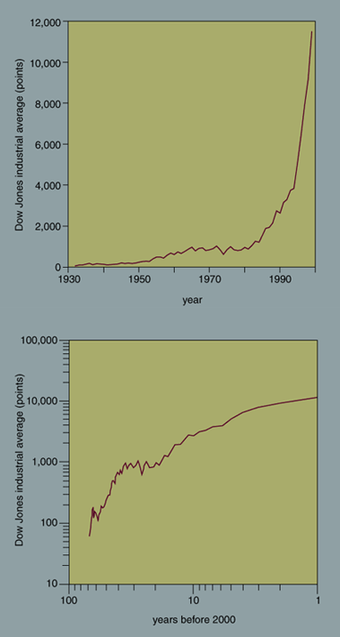
Indeed, with the exception of a catastrophic decline, almost any plausible rate of growth will seem to level off on such a graph. Consider, for example, the Dow Jones industrial average. Although the Dow grew more rapidly in the 1980s and '90s than it did in the two decades before, plotting it using Deevey's scheme appears to show the average stabilizing toward the end of the 20th century.
What changes in population would produce something like Deevey's bumpy line on a graph with logarithmic axes? Three successive rises followed by plateaus would result from a population that expanded at one rate for one period, increased to a higher rate for a second period and increased again to a yet higher rate during a third period. For example, if one simply takes the estimated population of 1 million years ago, allows it to increase 0.0004 percent per year until 10,000 years ago, then 0.05 percent per year from 10,000 to 300 years ago, and finally 0.7 percent per year during the last 300 years, the resulting plot looks very similar to Deevey's.
What sort of growth would be needed to show an obvious increase on a graph with two logarithmic axes? To rise as a straight line, a variable must make its next order-of-magnitude increase in an order of magnitude less time than the previous one. This is a tall order. For example, consider a population that went from 100 to 1,000 in 100 years, an annual increase of 2.33 per cent. To plot as a straight, upward-sloping line, the population would have to reach 10,000 in the next 10 years and then hit 100,000 in the following year. No population of organisms could long keep up such accelerating multiplication. So regardless of the actual situation, all plausible positive rates of growth will appear to plateau on Deevey's graph.
Just how should population be plotted? There are several alternatives; the most appropriate choice depends upon the question at hand. For example, one can simply plot both time and population size on linear scales. This technique is well suited for situations where it is important to be able to read numbers directly from the graph. But when a population grows by orders of magnitude, the needed compression of the vertical scale obscures any interesting changes that happen at low population sizes. And using this format to plot the growth of populations over extended periods can produce instances where the slope of the line appears almost vertical, as if the rate of increase were infinite.
What about using a linear scale for time and a logarithmic scale for population size? This combination is common in the ecological literature. Changes at small sizes remain detectable even with a population that later becomes quite a bit larger. Moreover, figures with a linear time axis and a logarithmic population axis have a convenient feature: A constant percentage rate of increase plots as a constant slope. This attribute makes it easy to detect changes in the rate of growth, which appear as shifts in the slope of the line. Indeed, such log-linear graphs can be very illuminating. Using one to track the Dow would readily show that the annual rate of increase in stock prices tended to be larger during the 1980s and '90s than it was during the '60s and '70s.
Deevey's graph suggests the present population is hardly changing, after having grown rapidly at three times in the past. Yet the opposite is actually the case. During the past half-century, population rose roughly 1.8 percent per year while growth rates during Deevey's three steep phases were only 0.0003, 0.07, and 0.24 percent per year respectively.
The purpose of a graph is to help detect patterns, or the lack thereof. Plots made with a logarithmic time scale tend to look the same regardless of what they represent. They not only obscure changes, they also give the impression that the variable under study is stabilizing, whatever the actual situation. This is especially dangerous when it lulls people into thinking that the recent expansion of population has effectively ceased. Arguments about when and how the population will stop increasing are more important now than ever before. People should not let these tricky graphs cloud the debates they are intended to illuminate.
Click "American Scientist" to access home page
American Scientist Comments and Discussion
To discuss our articles or comment on them, please share them and tag American Scientist on social media platforms. Here are links to our profiles on Twitter, Facebook, and LinkedIn.
If we re-share your post, we will moderate comments/discussion following our comments policy.