Symmetric Bat Flight
By Robert Kosara
An award-winning image models the flow of air around a bat's wings
An award-winning image models the flow of air around a bat's wings

DOI: 10.1511/2008.73.348
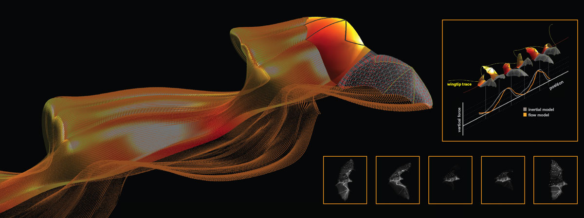
From a shimmering wave of orange emerges the shape of a bat, its outstretched wings ready to propel it out of the frame. The image, which took first place in informational graphics in the 2007 National Science Foundation–Science and Engineering Visualization Challenge, is in fact rich with aerodynamic detail derived from observations of bats in wind tunnels and simulations of the airflow around their wings when flying. It was created by David J. Willis of the Massachusetts Institute of Technology and Brown University, Mykhaylo Kostandov, Daniel K. Riskin, David H. Laidlaw, Sharon M. Swartz and Kenneth S. Breuer of Brown, and Jaime Peraire of MIT, with support from the U.S. National Science Foundation and the Air Force Office of Scientific Research. "Sightings" guest columnist Robert Kosara talked with Laidlaw, who works in virtual reality and visualization, about how this collaboration came about and what makes bats so interesting.
Images courtesy of David H. Laidlaw.
R. K. How did you get involved in this project?
D. H. L. A few of us met several years ago to talk about how to study flight. Sharon Swartz discussed her interest in how bones and different membranes work, and I described the challenges in looking at fluid flow data. We starting toying with the idea that it might be possible to simulate the air flow around a bat's wings. We chose the Southeast Asian short-nosed fruit bats (Cynopterus brachyotis) for very practical reasons, like its size, flight speed, the Reynolds number it flies at, how easy it is to train, house and acquire it. From there, things just grew as we approached different people and started addressing the questions in class projects, doing simulations and visualization, etc. There was quite an evolution over time.
R. K. What were the challenges in preparing these images?
D. H. L. The main challenge in this project was really the simulation. We have been working on this for several years now, but it remains hard. We can look at simulations that are not very accurate, but that doesn't tell us anything about the biology. We still don't have really good high-accuracy simulations, only approximate ones (from the group at MIT that has been collaborating with us) that assume a Reynolds number of infinity, which means no viscosity. We have some papers under review about this work now, and have had some posters at conferences in the past, but these were limited by the simulation issue.
R. K. What do the colors represent in the image?
D. H. L. The colors show the aerodynamic forces on the bat wing as it moves through the air. We chose a blackbody color scale, which is common in physics, to represent the values.
R. K. Why is a part of the image a mesh rather than solid?
D. H. L. This was mostly chosen by David Willis, who did the simulation, and also much of the visualization on this image. On the right, you get an idea of the mesh used in the simulation, the fact that it is curved, and also the discrete elements within the wake. On the left, you can see the bones better, and things also look more smooth and continuous, so you get a sense how they interpolate and blend together. The whole simulation is actually symmetric, so these are really two ways of looking at the same information.
Click "American Scientist" to access home page
American Scientist Comments and Discussion
To discuss our articles or comment on them, please share them and tag American Scientist on social media platforms. Here are links to our profiles on Twitter, Facebook, and LinkedIn.
If we re-share your post, we will moderate comments/discussion following our comments policy.