Visual Answers to Scientific Questions
By Howard Wainer, Michael Friendly
Graphics that convey process, structure, and instruction can act as intermediaries between information and understanding.
Graphics that convey process, structure, and instruction can act as intermediaries between information and understanding.

In 1787, Charles Gravier, Count of Vergennes, delivered a gift to the King of France, Louis XVI: A book by William Playfair, a young Scottish engineer, which had been published in London a year prior. Titled The Commercial and Political Atlas, it contained no maps, but instead displayed innovative charts of principally economic data. Louis XVI, an amateur geographer and owner of many fine atlases, examined his new acquisition with great interest. Although the charts were novel, he had no difficulty in grasping both their content and their purpose. He is reported to have concluded that the charts “spoke all languages and were very clear and easily understood.” The communicative clarity and universality of the visual form has been rediscovered and repeated endlessly in the more than two centuries since the last French monarch.
Humans have used visualizations to answer important questions for millennia. Charts and diagrams that show spatial representations of distinctly non-spatial phenomena are a more recent development, and they tend to get a lot of modern glory in big data mining and visualization. However, for a much longer time, visualizations have been spatial representations of spatial phenomena, maps being the most obvious example of visual space being used, in miniature, to represent geographical space.
These visualizations—drawings, illustrations, and photographs—of space as space, represent a literal lifelikeness, as in graphic violence and graphic novel. Ironically, this definition of graphic is not listed first in dictionaries, even though it is the far older usage.
The preference for visual over verbal descriptions of real-world phenomena accelerated in the late 18th century with the rising popularity of the epistemology espoused by the British empiricists, especially David Hume. They believed that language, developed before science, was not as well suited for scientific communication as other means, especially visual ones. By 1878, most natural scientists agreed with what French physiologist Étienne-Jules Marey had said on the value of graphical representation:
There is no doubt that graphical expression will soon replace all others whenever one has at hand a movement or change of state—in a word, any phenomenon. Born before science, language is often inappropriate to express exact measures or definite relations.
Since Marey’s time, language has obviously not disappeared in the service of conveying science or other information, but there can be no doubt that visualizations have blossomed. To examine the growth and power of visualizations, we have chosen to look back to the 19th and 18th centuries, specifically at examples of falling cats, the physical character of a woolly mammoth, and ship building. What these graphics have in common is that they provide a uniquely effective way to think about and understand scientific phenomena.
There is a rich history of examining such graphics to visualize the unseen or to understand the unknown. The graphics answer basic questions, such as: How do I get there? How do I do it? What happened? Why did happen? But they also serve the deeper purpose of acting as an intermediary between information and understanding. They can communicate what was found to a broader community, and preserve what was ephemeral for distribution to all—not just the lucky few who were in the right place at the right time with the right equipment. In addition, they have often been called into service for their believability. Edward R. Tufte, in his classic 1983 book The Visual Display of Quantitative Information, made the point that effective displays provide “beautiful evidence.”
Aristotle, in his Metaphysics, observed that “we understand best those things we see grow from their very beginnings.“ And indeed, if answering questions was all that visualizations could do, their place in the pantheon of scientific tools would be secure. But as Princeton University polymath John Tukey reminded us in 1977, “a picture achieves its greatest value when it forces us to notice what we never expected to see.” Graphics, representing space as space, have been invaluable in the past (as the following examples illustrate), remain vital in the present (as shown by your car’s GPS or the weather maps on the nightly news), and they will no doubt continue to provide a valued complement to synthetic statistical graphs to guide us in the future.
The question of how a falling cat almost always lands on its feet has attracted the interest of some legendary mathematical physicists, including James Clerk Maxwell and George Gabriel Stokes. It was commonly believed that cats had a “righting reflex,” so the empirically minded Maxwell and some of his contemporaries attempted to determine such data as the minimum height of fall for a cat to fail to right itself. At that time, cat defenestration was reputed to have caused death or injury to not a few felines in the name of science.
But the exact mechanism of the cat’s usual response and an understanding of how it could accomplish this righting were unknown. To physicists, the problem was how a cat could turn itself over without violating the laws of physics. The principle of conservation of angular momentum meant that rotational change must remain constant unless acted upon by an external torque, so how could a cat rotate in three-dimensional space in the absence of an external force?
Etienne-Jules Marey/Wikimedia Commons
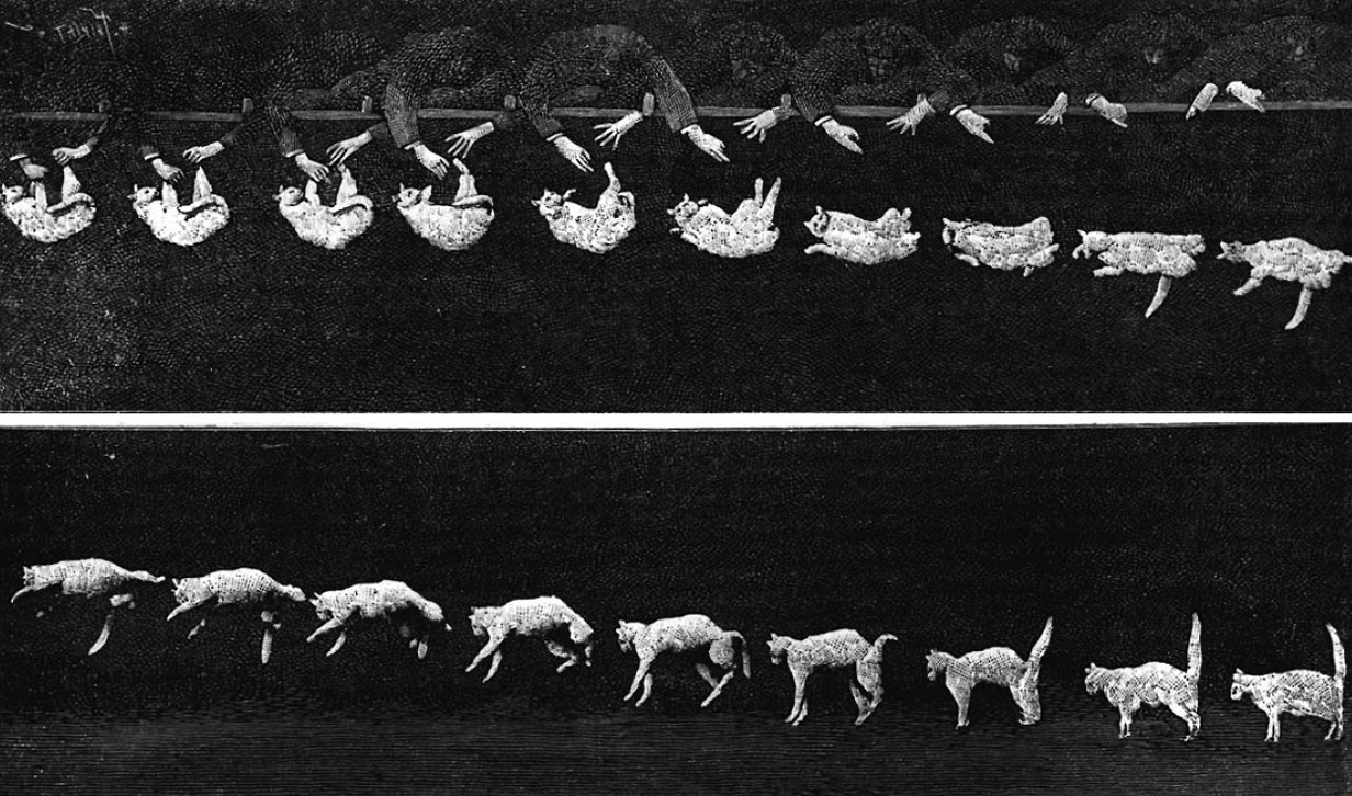
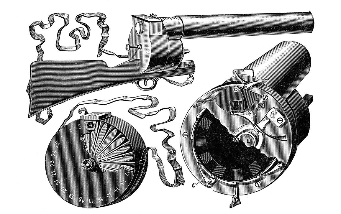
Étienne-Jules Marey, a French scientist, physiologist, and chronophotographer, saw this question as just another applied scientific problem that he could tackle with his chronophotographic gun—an instrument that could take 12 consecutive photos per second at the pull of the trigger. In 1894 he carried out a series of empirical studies of falling cats at his Physiological Station, a lab space were he photographed people and animals as they walked, ran, leaped, and jumped, against a black background. The figure above shows that during the experiment, a cat was held by its feet and let go in that position. One chronophotographic gun was used to record the side view, while another recorded the end view. Marey also arranged these frames into a short film, making the first cat video.
As the images show, the cat’s vertical position is nearly the same in the first frames while the assistant opens his hands, until the cat is finally in free fall. It is remarkable that the cat’s righting response is immediate, and is nearly completed in frames six through eight. But equally, detailed inspection provides a close account of the cat’s plan for a happy landing. In frames 11 to 13, as the cat is approaching the ground, its legs are still stretched out, front and back, then from frames 14 to 16, it does two things: first, it extends its feet down for landing, and then arches its back to absorb the shock. Finally, in the ending three frames, the cat raises its tail, to achieve balance in its landing position.
FALKENSTEINFOTO/Alamy Stock Photo
Marey published his investigations of the motion of falling cats in the prestigious French Proceedings of the Academy of Sciences (Compte rendus de l’Academie des Sciences). He was able to conclude that it was the inertia of the cat’s own mass that enabled it to right itself, using separate actions of its muscles in its front and rear halves.
As this example shows, the unaided eye was unable to discern the answer to the widely asked question of how a cat can right itself while falling and thus land on its feet. But once the eye was augmented with the proper equipment, an answer was obtained that could be universally agreed upon, with additional interpretation. Not only could the scientists see the data, but others were able to “read” these images as well, and draw their own conclusions. An anonymous writer in Nature made these observations: “The rotation of the fore and hind parts of the cat’s body takes place at different stages. At first the twist is almost exclusively confined to the fore part, but when this amounts to about 180 degrees the rear part of the animal turns.” The writer also noted the cat’s “expression of offended dignity . . . at the end,” concluding that it indicated “a want of interest in scientific investigation.”
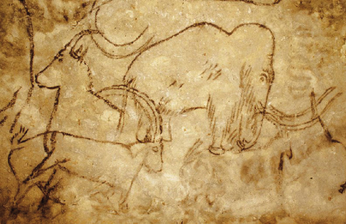
On the walls of caves at Lascaux and Rouffignac in the south of France are some the earliest examples of human visualizations. There are hundreds of remarkable paintings and drawings of animals, humanlike figures, and abstract or geometric signs, which carbon dating has estimated to be about 13,000-17,000 years old. Although these cave drawings are stylized, they are spectacular by any measure. The animals depicted were so majestically rendered (below) that the French historian Henri Abbé Breuil (1877–1961) called Lascaux ”the Sistine Chapel of prehistory.” The value of such visual communications has sometimes proved to be profound. Through such depictions, the original artists have reached out across the centuries and aided modern understanding of ancient creatures.
The History Collection/Alamy
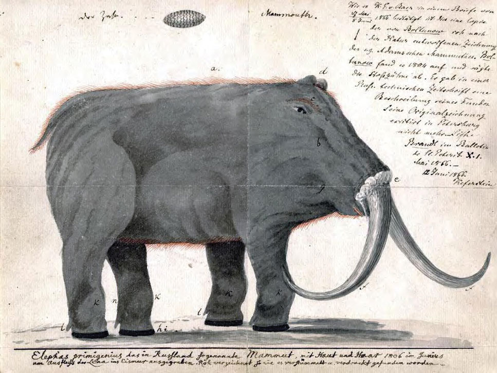
The story of the reconstruction of the woolly mammoth serves as an example. In 1801, Charles Willson Peale, a curator of one of the first museums of natural history in the United States, put a mammoth skeleton on display in Philadelphia’s Philosophical Hall. The skeleton was a mixture of anatomy and guesswork; missing bones had been replaced by wood or papier-mâché. The exhibit proved so successful that Peale took it on the road, displaying it in both London and Bristol. A contemporaneous drawing based on Peale’s skeleton (below), however, shows that among his other mistakes, he had the tusks on upside down. Peale was even confused about the mammoth’s eating habits, describing them as carnivorous.
Among other mistakes, Peale had the woolly mammoth’s tusks on upside down.
Peale had reconstructed the animal from fossilized bones, anatomical surmises, and analogical reasoning based on elephants, the animal’s nearest living relatives. Modern reconstructions get woolly mammoth anatomy right—upward curling tusks, humped shoulders, downward sloping spine—a result obtained not solely by studying bones but also by looking closely at the art of those who observed the animals firsthand. More than half of the hundreds of drawings left by Paleolithic artists on the walls of the Rouffignac cave were of woolly mammoths. This resource was unavailable to Peale. Although the cave’s art had been known about from the 15th century, it was not widely studied until the 1940s.
Rapp Halour
Peale’s case, compared with the modern rendering of the woolly mammoth, shows the power of the drawings to answer the question, What did the animal look like? These illustrations offer a window into the deeper context of the history of science by also provoking the question, How did these animal live? Although the answer to the deeper question is not entirely clear, having an accurate answer to the first one means that investigators can at least begin on the right path, so it is difficult to overestimate the power of firsthand observations accurately conveyed.
Some of the things that people knew how to do long ago now seem mysterious to us. For instance, it is difficult for us to imagine the combination of science and craft required for shipwrights to efficiently transform the contents of a local forest into a 19th-century, 24-gun frigate for the British Royal Navy. How did they look inside the tree to see what parts could be used for different purposes, and then make a diagram to show how it could be done?
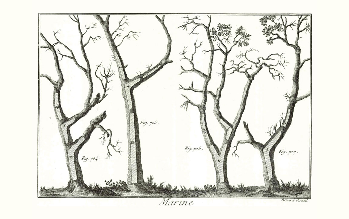
Historic Images/Alamy Stock Photo
The figure above is from Charles- Joseph Panckoucke’s 1783 marine encyclopedia, and shows how shipwrights could inscribe on trees the parts of the ship they needed to build the whole vessel. Long, straight tree trunks would become the ship’s masts; shorter, straight sections would be its spars or yardarms, and forked sections would naturally fill and buttress the bow or various overhangs. The trees were then efficiently harvested, and the sawyers would use the figure to guide their cutting.
This graphic is an early example of visual thinking and visual explanation that compactly answers: How do I do it? How do I transform the trees like those found in a local forest into the necessary parts to build a ship? Such instructions could be expressed verbally, in the same way that someone might provide you with turn-by-turn directions when you are lost. But how many words would it take to lay out the structure of tree selection and the necessary carpentry to serve the purposes of the shipwrights? And in how many different languages would the instructions have to be repeated to make them universally understood? But, as with asking for directions and being drawn a map, this illustration gives immediate, memorable instructions that can be utilized, and the lessons implicit in it are easily generalized for future use.
Click "American Scientist" to access home page
American Scientist Comments and Discussion
To discuss our articles or comment on them, please share them and tag American Scientist on social media platforms. Here are links to our profiles on Twitter, Facebook, and LinkedIn.
If we re-share your post, we will moderate comments/discussion following our comments policy.