Portraying Cougars' Migration on the Cover
By Barbara Aulicino
Using an illustrated double-exposure conveys both movement and stasis.
November 9, 2018
From The Staff Art
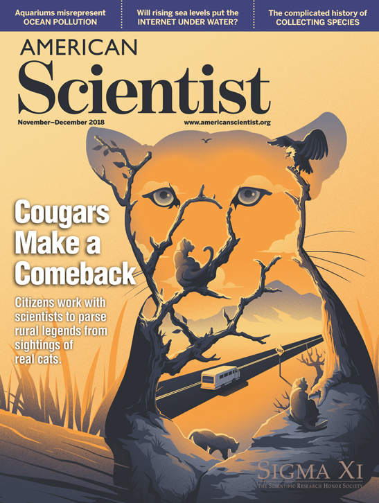
For American Scientist's cover, we try to create eye-catching custom images that visually encapsulate the theme of the featured article. For the November–December 2018 cover story on cougars’ eastward migration in North America, the challenge was linking a cougar image to the main ideas of the article. I thought that combining a cougar photo with an image suggesting the animal’s movement eastward could be hauntingly beautiful, and could also clearly convey the article’s topic.
Cougars are photogenic animals, and there was a wealth of images of them in stock photography and public domain collections. Image manipulation plugins and filters, such as making a photo look like a painting, were considered. These techniques are certainly fun to play with, and can yield striking results. But how could I suggest the concept of movement east?
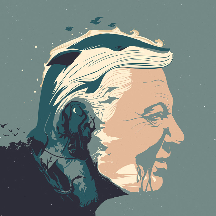
A photographic technique called double exposure, which superimposes one image over another to create a new image, was something I wanted to explore. I was collecting suitable public domain images to use in a double exposure, when the work of Hong Kong–based illustrator Eric Chow caught my attention. Eric’s double exposure-like portrait of Sir David Attenborough (above) was really clever. I immediately thought that this style of illustration could work well for what I had in mind.
So on a very tight deadline, Eric and I began to work on our cover illustration. Three rounds of sketches later, the concept clearly emerged.
Round 1
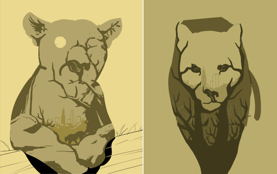
Eric initially used the Chicago skyline inside the cougar (below), which didn’t seem like it would be recognizable enough for readers to get the concept of cougars moving eastward and not just in urban areas. It was too subtle.
Round 2
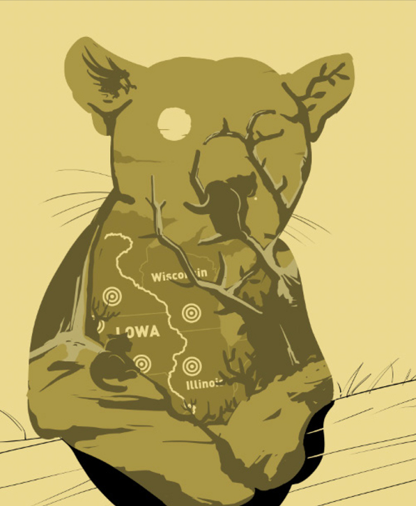
In the second round of sketches, I asked Eric to consider trying some other imagery inside the cougar, including a map of the midwestern United States. This approach ended up not quite hitting the mark either. A map indicated location, but it wasn’t clearly suggesting movement. It could be interpreted to show the range of cougars, for instance, rather than their migration.
Round 3
In the third round, Eric used one of my original imagery suggestions—a roadway going east. I had also asked him to render more detail, color, and contrast. This third sketch was tighter, and succeeded in connecting the cougar to the idea of movement. It worked even better when I asked Eric to flip the image horizontally. In Hong Kong they drive on the left. In the United States we drive on the right, and we think of east as to the right. Flopping the image was an easy fix.
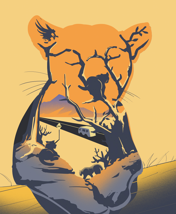
After final refinements, such as rendering more realistic eyes, and adding texture and more details, we had our cover image. This double exposure effect was what I was looking for, with Eric’s additional charm of using imagery to define the animal’s features. Remarkably, the entire process took less than 5 days. Here’s the result.
Eric Chow is a Hong Kong–based illustrator. He started his illustration career soon after graduating from London College of Communication in 2012. Eric produces his conceptual illustrations digitally using a powerful surrealist style, often bold and graphic. His work has been featured in Monocle, The Financial Times, Men’s Journal, and advertising campaigns for AMEX and Threads.com. Eric’s work is also regularly featured in the Infinite Bad podcast series, which earned him an award in 2018 by Communication Arts for advertising/entertainment illustration.
American Scientist Comments and Discussion
To discuss our articles or comment on them, please share them and tag American Scientist on social media platforms. Here are links to our profiles on Twitter, Facebook, and LinkedIn.
If we re-share your post, we will moderate comments/discussion following our comments policy.