FluorEssence
By Felice Frankel
See the winning image from this year's Science and Engineering Visualization Challenge
See the winning image from this year's Science and Engineering Visualization Challenge
DOI: 10.1511/2005.56.548
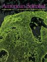
Again this year, I am sharing with American Scientist readers a winning image from the Science and Engineering Visualization Challenge, a contest sponsored by the National Science Foundation and the journal Science for which I was a judge. This year's award in the Informational Graphic category went to a stunning and wonderfully informative reference chart titled "FluorEssence." Chris Hardee is vice president of marketing at Omega Optical, a manufacturer of optical filters for fluorescence microscopy and instrumentation, and headed the creative team.
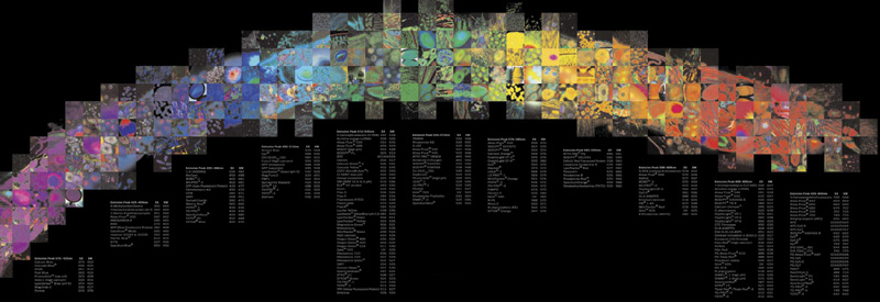
Image courtesy of Omega Optical, Inc.
F. F. Tell us first what we're looking at, Chris.
C. H. Fluorophores [chemical groups that absorb light of one wavelength and emit a different one] are incredibly important to biomedical researchers, as they are used to stain and visualize parts of cells or tissues, which in turn provide a window to structure and function. They are visualized by excitation with a light source that produces a characteristic emission, or fluorescence. There are hundreds of fluorophores, and they are identified by their excitation and emission peak wavelengths from the ultraviolet to the infrared portion of the spectrum. This poster contains those identifying wavelengths for approximately 250 of the most commonly used fluorophores. It is meant to serve as a reference tool that is also aesthetically beautiful.
F. F. What sparked the idea for the poster, and who else was involved with the concept?
C. H. I've been intrigued with photographic mosaics ever since I first saw Robert Silvers's book Photomosaics a number of years ago. While representations of the spectrum are used frequently to communicate information in the science of optics and the optics industry, for me they lack imagination. I thought it would be great to create a mosaic of the visible spectrum using the rich archive of imagery that we have accumulated over the years from researchers who are using our filters in microscopy applications.
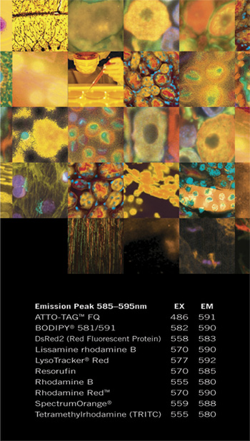
Image courtesy of Omega Optical, Inc.
The marketing department at Omega Optical worked on the conceptual design, which we handed off to our out-of-house graphic design firm, Woodward Design. Fluorophores are not neatly divided into universally accepted categories, so we created "color families" based on the classification systems of a number of researchers and companies that we found on the Internet. Our image archive was "mined" for mosaic pieces, which were hand-sorted by the graphic-art team into the same color families. The designers came up with the beautiful realization of the spectrum, which to me looks like the stroke of a paintbrush or a character of calligraphy, an appropriate metaphor for the biological images that fluorophores paint.
F. F. Did you consider making this an interactive reference chart?
C. H. That's not the first time that question has been asked, and while we have discussed it as an option we have never seriously considered turning it into an interactive because we already have a very useful interactive tool on our Web site. This tool, the Curv-o-matic, is a database that matches fluorophore spectral data and the spectral curves of available filters.
Click "American Scientist" to access home page
American Scientist Comments and Discussion
To discuss our articles or comment on them, please share them and tag American Scientist on social media platforms. Here are links to our profiles on Twitter, Facebook, and LinkedIn.
If we re-share your post, we will moderate comments/discussion following our comments policy.