Dark Matter Comes to Light
By Richard Massey, Lars Christensen, Felice Frankel
Creating astronomy's first maps of this mysterious substance
Creating astronomy's first maps of this mysterious substance

DOI: 10.1511/2007.65.257
A query from Sightings contributor Felice Frankel sparked a lively dialogue between two of the makers involved in creating astronomy's first maps of the "dark matter" of the cosmos.
R. J. M. My colleagues and I recently used the Hubble Space Telescope to make the first large-scale maps of the mysterious substance known as "dark matter." Dark matter is completely unlike the familiar material from which everything around us is built—everything that we can see, touch or breathe. For a start, dark matter is completely invisible! So, aside from the difficulty of finding it in the first place, our map raises a rather tricky data-visualization problem: how to best represent an invisible substance?
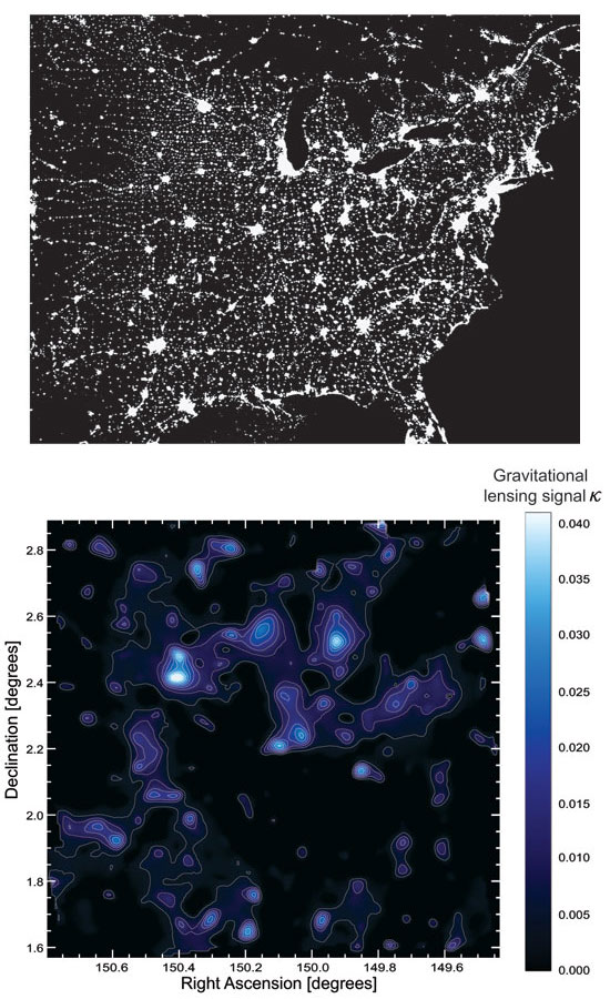
Image above NOAA/DMSP; image below adapted from Nature 445:286–290, courtesy of Richard Massey.
L.L.C. You could compare previous maps of the cosmos—made by mapping luminous galaxies—to nighttime snapshots of a city. Streetlights illuminate some highways and intersections, but most of the interesting neighborhoods remain obscured. In the satellite image of North America at right, you just can't see most of what's there.
R. J. M. The universe is exactly the same: The glowing stars, galaxies and planets make up only one-sixth of the total landscape. The remainder is a grand but invisible skeleton of dark matter. It is the infrastructure of the cosmos, literally holding the universe together.
We can't see dark matter directly, but we can infer its presence via the effect it has on things we can see. So we looked at ordinary but incredibly distant galaxies, which make a wallpaper pattern on the far side of the universe. Light from these galaxies had to pass through any intervening dark matter during its long journey to us. The dark matter shows up in a sort of silhouette against those background lights—but it's not that the distant galaxies look fainter, rather that they change shape. This "gravitational lensing" is like looking through a wobbly sheet of glass. Nearby dark matter gives itself away by distorting the apparent shape of objects behind it.
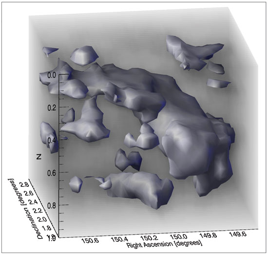
Image adapted from Nature 445:286–290, courtesy of Richard Massey.
We used Hubble to study the shapes of half a million galaxies, and made a two-dimensional map of dark matter in a patch of sky eight times the size of a full moon. The colors in this were kept dark and shaded blue for a cold, icy feel. Blue is normally avoided in data visualization, because the poor response of the eye makes it difficult to see details, but that seemed wholly appropriate! The contours were omitted by artist Zolt Levay in a separate version, to provide a smoother, flowing texture.
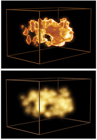
Images courtesy of Martin Kornmesser, European Space Agency/Hubble.
A tougher visualization challenge was posed by our 3-D dark-matter map, which we obtained by also measuring the distance to lumps of dark matter. We made a 32´32´20 data cube, each voxel containing the measured density (a voxel is a cubic unit in a 3-D volume, analogous to a pixel in a 2-D image). I first drew an isodensity surface, which captured some of the filamentary structure. However, this opaque surface felt too solid and frustratingly discarded information about the densest clumps, which were hidden from view. To meet publication deadlines, the figure was scheduled in November for an article in Nature. The rest of the COSMOS team ridiculed my apparent pile of deformed potatoes, despairing that such grocery would ever sell to the public. Clearly needing help with visualizations for our January press release, we approached professionals at NASA and the European Space Agency (ESA).
L.L.C. Although time was short, and holidays intervened as the American Astronomy Society meeting date approached, we realized the potential of spending time on the data to present this amazing result in a more intuitive manner.
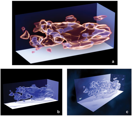
Images courtesy of Martin Kornmesser, European Space Agency/Hubble.
Designer Martin Kornmesser and advanced developer Kasper Nielsen at ESA made another isodensity surface, importing this information as a virtual-reality markup language file into a program used for high-end visualization and movie animation.
R. J. M. We debated a while about geometry. The survey is of a fixed angle on the sky, so it really covers a cone-shaped volume. But showing the data set as such made it look like the universe is getting smaller over time—whereas the reverse is true. To avoid confusion, we sidestepped the issue and compressed it into a box.
L.L.C. Along the way, we made several attempts to capture the diffuse nature of dark matter, experimenting with various software techniques. The rendering was smoothed using a tool for subdividing and refining the representation of surfaces. Light sources were placed inside the isodensity surfaces.
We worked with glow effects, and in the end used a Fresnel shader as texture to give the transparent look that helps in getting an overview of the magnificent 3-D structure. It was then colored blue. The shader applies the principles of the Fresnel effect, the fact that reflectance depends on the observer's viewing angle. The impression on the eye is similar to looking through water.
We also experimented with context. Clearly the 3-D "blobs" look nice but have little connection with the actual universe. One of our drafts featured the background galaxies, whose photons were so instrumental as "test particles" for probing the gravitational pull exerted by the dark matter.
On top of the dark-matter-density peaks we sprinkled the luminous galaxies, which illustrated another important result: Dark and luminous matter are very well aligned, which independently confirms existing cosmological theories. We put in a little model of Hubble itself, out of scale, to indicate how the observations were done. In the end we decided that the way-out-of-scale Hubble and the fake galaxies introduced too much extraneous material, and we chucked the draft.
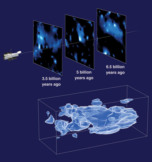
Image courtesy of Martin Kornmesser,
R. J. M. Actually, I really loved that image and have to confess that I slipped it to a couple of journalists. You were worried it looked like frogspawn, but I think that's a lovely analogy for the slippery and elusive dark matter! It shows how well the Fresnel effect works.
L.L.C. Yes, and we'd been working under such intense time pressure that we hadn't realized that you liked it so much.
In the end a large package of stills and video footage was released on the Web. The main image showed our ice-blue isodensity surface and three planes extracted from the scientists' data with indications of their distances in space. A little Hubble is observing them.
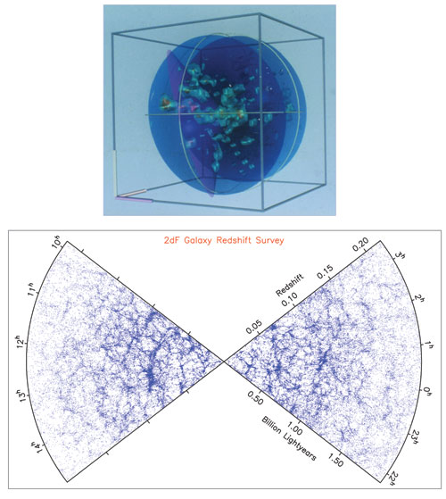
Images courtesy of Brent Tully, University of Hawaii, and the 2dF Galaxy Redshift Survey, respectively.
The pioneers in all this were R. Brent Tully at the University of Hawaii and later Margaret Geller and John Huchra of the Harvard-Smithsonian Center for Astrophysics. Tully was one of the first to map luminous matter—galaxies and stars—in the late '80s and early '90s. One of the ways he showed the maps in those early days, when relatively few galaxy positions were known, was to show their distribution with an isodensity surface.
Of course the resolution of Tully's representations has since improved. This will happen to the dark-matter maps in coming years. Funny how history repeats itself.
R. J. M. There's a natural instinct, when exploring an unknown place, to draw a map.We now know there's a lot of dark matter out there. Science continues the work of the New World explorers, adding flesh to the bones of a map to understand what's around us.
Click "American Scientist" to access home page
American Scientist Comments and Discussion
To discuss our articles or comment on them, please share them and tag American Scientist on social media platforms. Here are links to our profiles on Twitter, Facebook, and LinkedIn.
If we re-share your post, we will moderate comments/discussion following our comments policy.