Croplands Up Close
By Fenella Saunders
A highly detailed map of the world’s productive areas for crops corrects some misconceptions about how much is being grown and where.
A highly detailed map of the world’s productive areas for crops corrects some misconceptions about how much is being grown and where.

DOI: 10.1511/2018.106.1.6
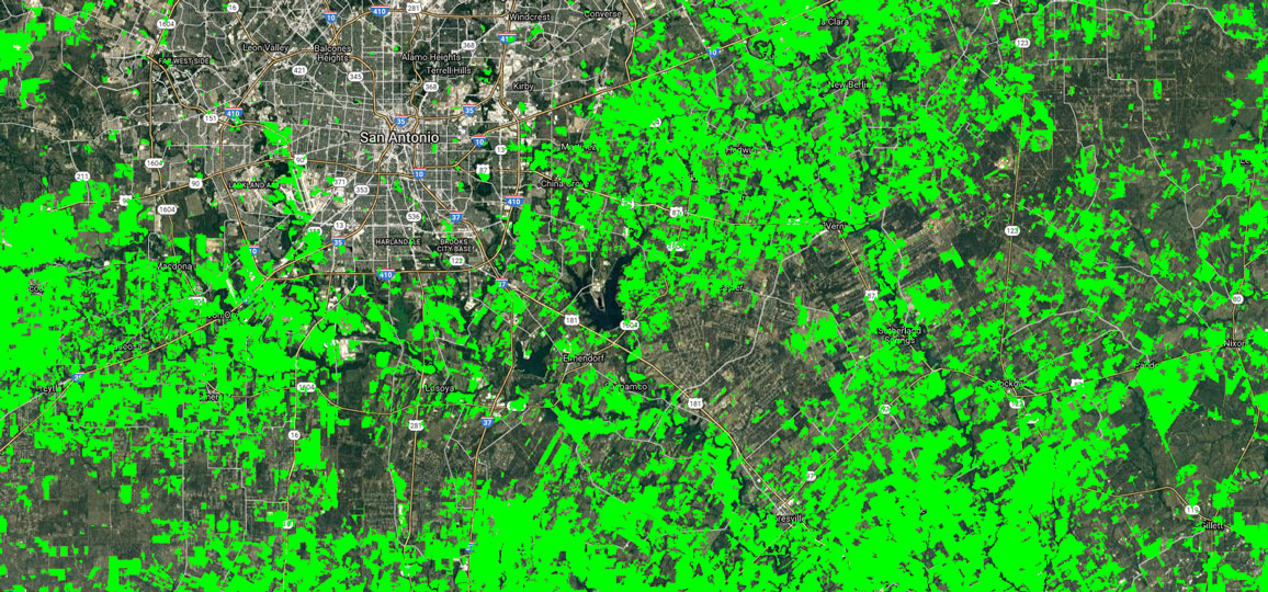
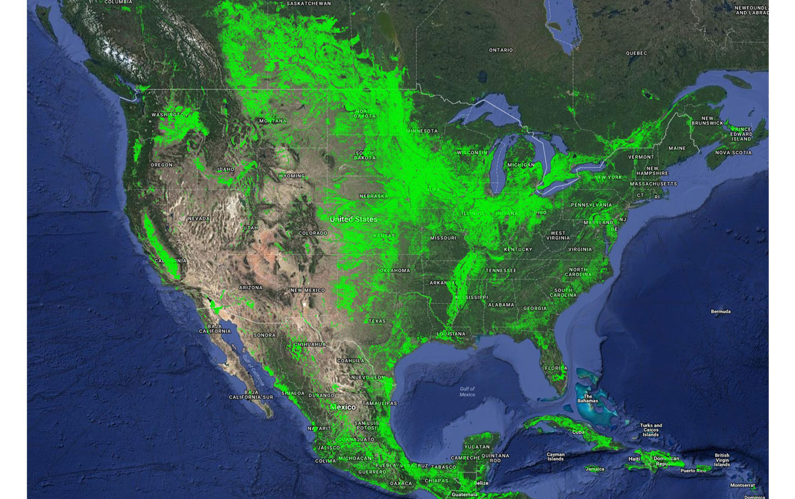
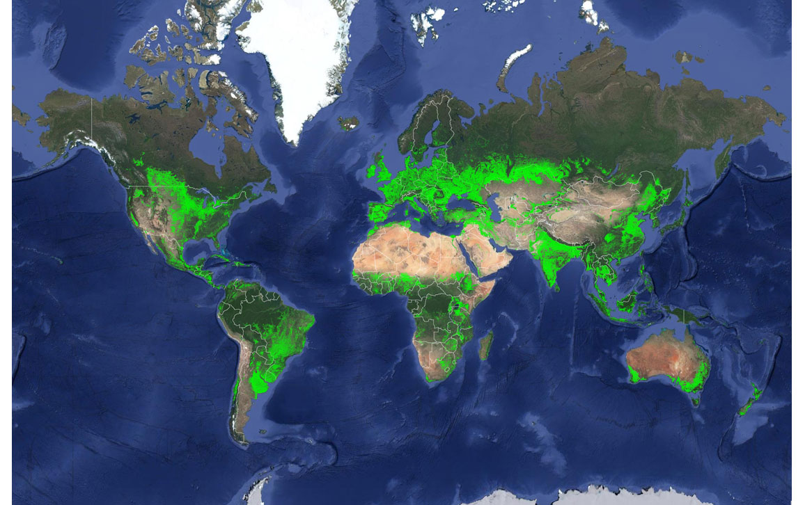
The U. S. Geological Survey recently released a new map of worldwide croplands (above and at bottom) that zooms in to a resolution of 30 meters, or about 0.09 hectares per pixel, and is the highest resolution yet for examining the world’s productive areas. A close-up of the map over Texas (below) shows the level of detailed imaging possible at such high resolution. And there were some surprises.
The increased accuracy of the map demonstrated that there is 15 to 20 percent more cropland on Earth than previous assessments had estimated, for a worldwide total of 1.87 billion hectares.
Earlier studies had also concluded that China or the United States has the highest net cropland area, but it turns out that’s not accurate either. This new map gives that status to India, with 179.8 million hectares, or 9.6 percent of the global net cropland area. The United States follows with 167.8 million hectares, which is 8.9 percent of the global net cropland area (below). China has 165.2 million hectares, and Russia has 155.8 million hectares.
But in terms of percentage of the country devoted to croplands, both the United States and China fall short, with only about 18 percent of the total geographic area. The distinction of being an agricultural capital goes to Moldova, Hungary, and San Marino, each of which have their geographic area made up by more than 80 percent croplands.
The study is part of a consortium, of which the U. S. Geological Survey is a member, called the Global Food Security-Support Analysis Data @ 30-m (GFSAD30) Project. The map is built primarily from Landsat satellite imagery from 2015. “One major challenge was obtaining cloud-free images in regions such as the tropics and during rainy seasons. That took multiple years in some areas. This project required the use of satellite-acquired big-data analytics using machine learning algorithms on a cloud computing platform,” said Prasad Thenkabail, U. S. Geological Survey research geographer and Principal Investigator for the GFSAD30 Project Team, in reports.
“This map is a baseline and starting point for higher level assessments, such as identifying which crops are present and where, when they grow, their productivity, if lands are left fallow and whether the water source is irrigated or rain fed,” said Thenkabail. “Comparisons can be made between the present and past years as well as between one farm and another.” The hope is that better data will lead to more efficient management of land and water for agriculture.
Click "American Scientist" to access home page
American Scientist Comments and Discussion
To discuss our articles or comment on them, please share them and tag American Scientist on social media platforms. Here are links to our profiles on Twitter, Facebook, and LinkedIn.
If we re-share your post, we will moderate comments/discussion following our comments policy.