
This Article From Issue
May-June 2006
Volume 94, Number 3
Page 274
DOI: 10.1511/2006.59.274
The Commercial and Political Atlas and Statistical Breviary. William Playfair. Edited and introduced by Howard Wainer and Ian Spence. Cambridge University Press, 2005. $39.99.
Anyone who has clicked the popular button that commands a spreadsheet computer program to make a chart has experienced the satisfaction of seeing a confusing grid of numbers resolve into crisp bars. It is hard now to imagine how we ever got by without visual tools for understanding masses of data. But of course such devices as the bar graph, the time-series line graph and the pie chart had to be invented. The peculiar man who came up with all three was William Playfair (1759-1823), a Scot who was convinced he could influence Britain's course with visual explanations of macroeconomic trends. Endowed with drafting experience and confident in the power of graphical language, he presented his polemics in a new form: annotated graphs that vividly highlighted trade gaps and the growing national debt.
Although Edward Tufte (author of The Visual Display of Quantitative Information [1983]) and others have noted Playfair's role as the leading originator of modern statistical graphics, access to his work has heretofore been limited. Finally Playfair can speak for himself: Facsimiles of two of his most important works—the 1801 edition of The Commercial and Political Atlas, and The Statistical Breviary of the same year—have now been published in one small, affordable volume.
Ad Right
The vision that emerges from Playfair's pages is one of startling clarity and foresight. Even those who have seen samples of his charts—perhaps in Tufte's 1983 book or in statistician Howard Wainer's 2005 volume, Graphic Discovery: A Trout in the Milk and Other Visual Adventures—will find new treasures here, all in color and some on foldout pages. The facsimiles are prefaced by a lively introduction in which the editors—Wainer and psychologist Ian Spence—give us a glimpse of the work's creator and his times.
Born in a village near Dundee, William was the younger brother of John Playfair, who became a distinguished mathematician, physicist and geologist. After learning drafting in the employ of the engineer-inventors Andrew Meikle and James Watt, William sought his fortune in London. Failing at the first of several doomed business ventures, he turned to writing about economics. The Commercial and Political Atlas—a series of 44 graphs charting selected trends in England's trade and national finances, each followed by remarks and observations—appeared in a preliminary edition circulated privately in 1785.
Playfair's Atlas was a historical singularity. Graphs and charts did not, as one might have assumed, coevolve with science, business and government. Rather, the new medium emerged full-blown in Playfair's works (although other graphic forms did crop up in isolated experiments around the same time). And then, just as quickly, it vanished.
Graphic explanation simply did not catch on. Excellently constructed by today's standards, Playfair's charts were in his own day neither praised nor imitated. He eagerly sent copies to well-placed acquaintances, yet most took no interest. One of the few exceptions was the French king Louis XVI, who understood immediately that the charts "spoke all languages."
Another century or so would pass before the emerging field of statistics grasped the power and utility of graphical presentation. Wainer and Spence attribute the slow adoption of statistical charts to the intellectual climate of Playfair's Britain, where empiricism was ascendant. The empiricists, who argued that knowledge arises from sensory experience, recorded observations and plotted them on line graphs in their notebooks. But they valued rigor and precision, and pictures created to represent observations were necessarily less accurate and more interpretive than were numbers themselves. A "general mistrust of pictorial representation" in British science continued into the early 19th century (and a cautious skepticism about graphic presentation of data remains part of scientific culture today). Watt tactfully urged Playfair to provide tables to support his arguments, pointing out that "the charts now seem to rest on your own authority, and it will naturally be enquired from whence you have derived your intelligence."
It didn't help matters that Playfair was a recklessly outspoken iconoclast—and even a bit of a scoundrel. Afflicted by a proclivity for questionable schemes when in financial straits, Playfair waded in and out of legal hot water while working on the Atlas and the Breviary. Convicted of libel in England and swindling in France, he later bungled an extortion attempt. His standing impaired by his checkered reputation, he was in his final years still publishing fine charts and advocating that others do so, but his arguments fell on deaf ears.
Wainer and Spence point out that innovation is frequently the product of an unconventional individual. Playfair fits this description, yet in the opening pages of the Atlas, he builds a case for his graphical approach on precedent, noting the practices of drawing family trees and creating historical time lines. "The studies of history, genealogy, and chronology," he says, "have been much improved by copper-plate charts." A data table, he insists, can leave the reader with only a "very faint and partial idea of what he has read."
Pointing to cartography as an established graphical form, Playfair urges the reader to see how a financial chart can map a different physical reality, money. Financial graphs, he says, can be understood as "piles of guineas represented on paper, and on a small scale, in which an inch (suppose) represents the thickness of five millions of guineas, as in geography it does the breadth of a river."
Playfair's most intriguing arguments are those in which he anticipates the findings of experiments on cognition and perception that were not carried out until two centuries later. Graphical representation, he argues in the Breviary, can "facilitate the attainment of information, and aid the memory in retaining it."
He had already proved the point in the 1786 edition of the Atlas, with the first published bar chart, which illuminated Scotland's 1781 trade surplus with America and its simultaneous trade deficit with Russia. It conveys its message to the eye in an instant. Like Playfair's other graphs, it has grid lines, axis labels and hatching, designed with a thoughtfulness that makers of graphing software would do well to emulate.
Playfair's graphs derive extra explanatory power from his detailed annotations. In a 250-year comparison between the revenues of England and those of France, he marks off the reign of each king. "We see the two nations advancing in revenue and expenditure with a pretty equal pace," the text explains, "till the revolution of 1789 changed the business, and has very nearly freed France from all her debts, while it has almost doubled those of England."
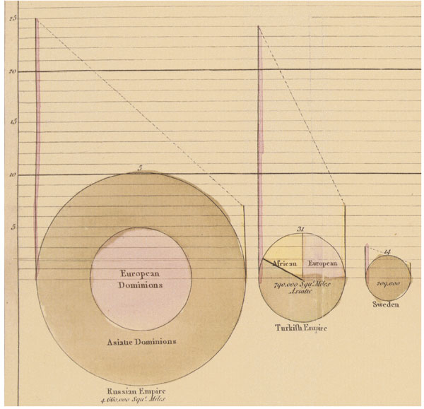
Detail from a larger chart in The Statistical Breviary.
Within a large chart in the Breviary one finds perhaps the most curious invention: a pie chart (see illustration). It is a crude attempt that seems nevertheless to have been drawn with delight. The pie-slicing is a solution to the problem of how to display land areas in an empire with more than two dominions. Yet here Playfair stumbles when he attempts to represent three quantities for each empire or nation—land area, fiscal data and population—in the same two-dimensional space. In so doing he introduces distortions, foreshadowing a common limitation of modern two-dimensional graphs. Playfair's discussion of this chart, though, seems carefully designed to restrain inference; he understood what his graphics could not do.
It's worth asking whether we've made substantial progress in the visual representation of statistical data since Playfair's time. Certainly graphs are widely used today for exactly the purposes he proposed. Even though tables retain the advantages of precision and transparency, rarely do we stare at tabular data to make statistical inferences; observations are plotted as soon as they are collected.
Technological change and society's need to make sense of the streams of data flowing from computers have made graphic representation of data ubiquitous. The Web, PowerPoint, Flash and statistics and spreadsheet programs have turned every computer user into a graphics producer and consumer.
However, many a modern graph does mask or misrepresent the properties of the underlying data. Today, equipped with powerful tools that do the searching for us, we may be less skilled at seeing patterns in raw data than were the early empiricists. Certainly we rarely think the way Playfair did about why and how to make a graph. In an age of exploding visual stimulation, we rarely even take the time to rest our eyes on a carefully crafted, simple chart and consider why it works so well. For those in search of such pleasure, I recommend passing a quiet afternoon with a certain con man from Dundee.

American Scientist Comments and Discussion
To discuss our articles or comment on them, please share them and tag American Scientist on social media platforms. Here are links to our profiles on Twitter, Facebook, and LinkedIn.
If we re-share your post, we will moderate comments/discussion following our comments policy.