
This Article From Issue
March-April 2009
Volume 97, Number 2
Page 150
DOI: 10.1511/2009.77.150
Every branch of science needs to observe phenomena and each has its instruments: microscopes, telescopes, spectrometers, interferometers. While many phenomena have meaningful, intrinsic spatial components, many more do not: the spectral composition of light, the genetic variety in a habitat or observations in a clinical study. To fully observe these, we need not only instruments to measure data, but also a tool that helps makes sense of it all: visualization.
Visualization is often valued for producing pretty pictures for publications. But in scientific disciplines that work in nonspatial realms (bioinformatics, chemistry, the social sciences and so on), visualizing data is useful very early in the process of discovery. Turning numbers into pictures enables scientists to use their human prowess with reading visual data to spot patterns, trends and outliers.
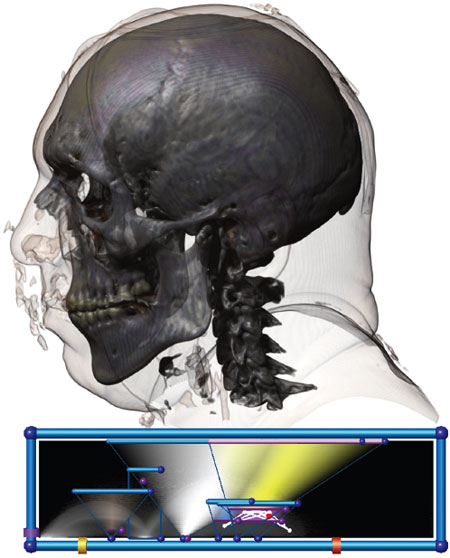
Joe Kniss/University of New Mexico
Ad Right
There is a historic distinction in the field of visualization between scientific visualization (SciVis) and information visualization (InfoVis). In SciVis, spatial information is almost always a given, coming from measured or simulated three-dimensional objects—photographic images of sorts. In InfoVis, researchers choose the most appropriate and informative layout.
The image above combines both approaches. At the top, there is a three-dimensional, SciVis rendering of CT (computed tomography) measurements of a man’s head. Below that, data measured within the head—curvature of structures, the boundaries between them and more—are isolated from each other in space. Separate and mostly triangular fields of varying densities and colors allow a trained viewer to better understand structures of interest within the head.
Bioinformatics, which uses computers and mathematics to make sense of biology, also greatly benefits from visualization. I was reminded of this recently by Anthony Fodor, a colleague at the University of North Carolina, Charlotte. Fodor works in metagenomics, the study of genetic material retrieved from environmental samples. In recent research he used common but effective visualizations to explore bacterial genomic data collected in a wastewater treatment plant.
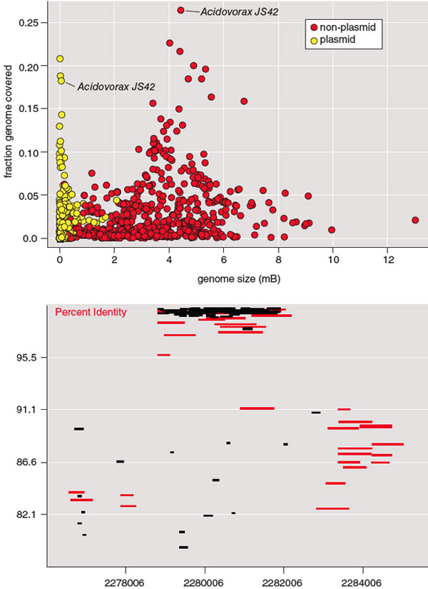
Figure at top courtesy of Applied and Environmental Microbiology/American Society for Microbiology. Figure at bottom courtesy of Anthony Fodor.
His team used pyrosequencing to extract short segments of DNA (around 250 base pairs) from individual organisms in a sample. The resulting data set of about 350,000 sequences was compared to known bacteria genomes using the widely accepted BLAST algorithm. As it turned out, more than 60 percent of the DNA sequences retrieved from such a well-controlled, artificial environment did not match known bacterial sequences. Even partial sequence matches were not common. The best match, the known bacteria Acidovorax JS42, shared only about 25 percent of its sequence with DNA retrieved from the plant. To better examine these strangers, Fodor isolated plasmids, even shorter DNA segments that bacteria exchange during reproduction, from his sample. Potentially they could produce more matches with known bacteria. As the upper figure shows, they produced fewer.
To take a look at the treatment-plant organisms from a different vantage point, Fodor and colleagues developed an interactive program that let them scroll through the entire genome of a particular organism. The lower screenshot shows DNA segment sequences shared by the treatment plant bacteria and, again, Acidovorax JS42. The base pair position of the known bacteria’s sequence is denoted on the horizontal axis; the vertical axis represents how frequently matching DNA from plant samples matched specific sequence spans. Black rectangles represent data from the treatment pools; red rectangles show data from a seawater sample for comparison.
Even though the vast majority of the DNA segments are not shared across the two samples, here one can easily spot frequently shared code. In Acidovorax JS42, this code is positioned in non-gene, or non-coding, parts of its genome, territory once considered “junk DNA” that hosts a transposon. Transposons are short DNA segments once known as jumping genes that can cut and paste themselves in a cell’s DNA. Transposons can activate non-coding DNA, and evidence is growing that, unlike most genomic regions, they are widely conserved in different environments. Based on this and other evidence, Fodor has hypothesized that “perhaps all life only exists to shepherd transposons.”
While these visualizations are simple, they are powerful. Without them, important patterns would be almost impossible to discover. For nonspatial data such as these, visualization is the microscope.
American Scientist Comments and Discussion
To discuss our articles or comment on them, please share them and tag American Scientist on social media platforms. Here are links to our profiles on Twitter, Facebook, and LinkedIn.
If we re-share your post, we will moderate comments/discussion following our comments policy.